The Hidden Dangers in User Interface Traps

The Hidden Dangers in User Interface Traps
Most people know that online companies and services collect a lot of information about you by default. But you always have the choice to opt out of these practices if you aren’t interested, right?
While this seems to be the case, it’s not always so. Many companies employ “dark patterns” to mislead you into giving away more personal information than you realize, or make other choices unknowingly.
Let’s take a look at how dark patterns use psychological biases to manipulate the choices you make, even if those decisions aren’t in your best interest.
What Are Dark Patterns?
DarkPatterns.org defines dark patterns as “tricks used in websites and apps that make you buy or sign up for things that you didn’t mean to.”
There are all kinds of examples, such as bad user interface design, misleading wording, and hidden options. Even color choice can be part of a dark pattern.
The site lists 12 types of dark patterns to watch out for:
- Bait and switch: You mean to do something, but the site changes it so something else happens instead.
- Confirmshaming: You’re guilted into accepting something because the decline option is worded to make you feel stupid.

- Disguised ads: Advertisements that pretend to be legitimate content, like fake download buttons.
- Forced continuity: A free trial ends and then starts charging your credit card immediately, often without an easy way to cancel.
- Friend spam: You give a site permission to use your email or social account to find friends, but it then uses that info to spam your friends, claiming to come from you.
- Hidden costs: Sites hide extra charges like delivery and handling fees until the very end of the process.
- Misdirection: The site intentionally focuses on one element to distract you from something else.
- Price comparison prevention: A retailer prevents you from comparing items with each other, so you can’t make a clear buying decision.
- Privacy zuckering: A service tricks you into sharing more information with it than you really want to.
- Roach motel: A situation that’s easy to get into, but difficult to get out of.
- Sneak into basket: During the process of making a purchase, the site sneaks additional items you didn’t ask for into your shopping cart.

- Trick questions: When a form seems to indicate something, but upon closer inspection, it asks for something totally different.
You can read more about these tactics on the Dark Patterns website, as well as our list of common dark pattern examples that aren’t necessarily related to privacy. You’ll likely recognize quite a few of them, and you might not have realized how widespread they are.
The big problem with these tactics is that humans aren’t well-equipped to deal with them. We have psychological biases, called heuristics, that make us more likely to respond in certain ways. And when companies take advantage of those heuristics, many people argue that they’re taking away our agency as consumers.
How Companies Trick You Into Giving Up Your Privacy

Image Credit:Deceived by Design
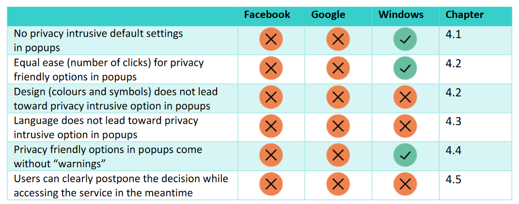
Let’s look at a few of the ways that sites commonly trick you into giving up more private information than you intend to, illustrated in a 2018 report on this topic titled Deceived by Design . It examines several tactics used by Facebook, Google, and Microsoft to trick you into selecting certain options.
1. Default Settings
This dark pattern is pretty obvious. Nobody is surprised that major companies default to collecting a lot of your data. They make money by using your data to show you more relevant ads, as well as selling your information to third parties, so they want as much info as possible.
GDPR protects how companies can use the information of those in the EU. It states that a service’s default settings shouldn’t enable more data collection than the service needs to function. Also, any other collection of personal data for unrelated purposes requires the user to explicitly give consent.
Services like Facebook and Google default to sharing as much information as possible, then make you go into the settings menu to disable information collection and sharing. That’s a dark pattern, because a lot of people won’t bother to tweak the settings.
A GDPR-compliant setup, without dark patterns, would have no default settings and let everyone choose whatever options they want from the start.
2. Ease of Changing Settings
How simple do these companies make it to change privacy settings? If you’ve ever used Facebook or Google’s privacy settings, you won’t be surprised to find out that it’s hard to turn data-sharing off. These services often choose images and text placement to encourage users to share more data.
Microsoft uses these visual nudging cues too, but in many cases, its services require the same number of clicks to give away data as to protect it. Facebook is notorious for requiring many clicks, a lot of reading, and various screens to figure out who can see your data and what they can do with it.
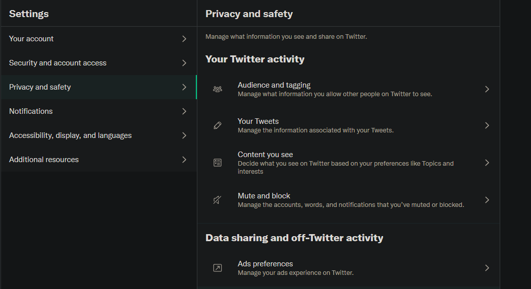
In contrast, Twitter’s privacy settings are pretty straightforward. They’re all clearly labeled and accessible from one menu, with no warnings about how disabling them will harm your experience.

3. Framing
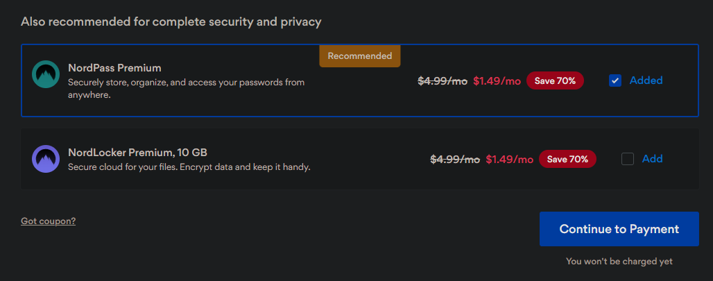
A huge part of dark patterns concerns how options are presented. Companies tell you the positives of letting them sell your data to advertisers, but not the negatives. And they tell you all the reasons you shouldn’t increase your privacy options, but none of the privacy concerns you might face without them.
The mentioned report gives Facebook’s facial recognition settings as an example. Facebook tells you the benefits of automatic tagging and warns that without facial recognition, it won’t be able to identify when strangers use a picture of you as their profile photo. While people impersonating you can be an issue on the site, most people wouldn’t consider it worth letting Facebook track your face.
Read more:Ways Facebook Invades Your Privacy (and How to Stop It)
In the same warning, Facebook also cautioned that people using screen readers won’t know if you’re in a picture without facial recognition. But they don’t tell you that advertisers might use facial-recognition technology to target ads, or anything else they might do with that data.
The California Consumer Privacy Act (CCPA) specifically prevents using dark patterns in this manner. In the state, using these deceptive tricks with “the substantial effect of subverting or impairing a consumer’s choice to opt-out” is not allowed.
4. Reward and Punishment
You’ve probably seen that both Facebook and Google warn that you’ll lose functionality if you protect your data. At the time of the report, when Facebook presented you with the option to delete your account, it failed to point out that you can download all your data first.
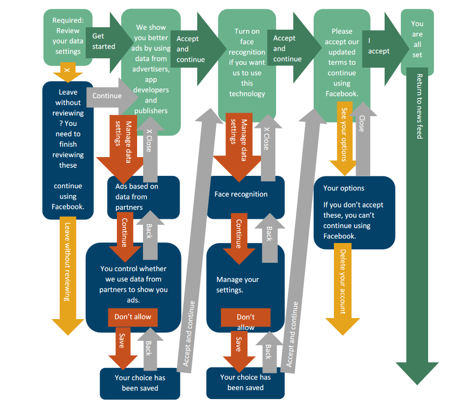
The site hopes you won’t want to lose all the information you’ve shared on it, so this is supposed to scare you into staying on Facebook. This deception is further illustrated by a flowchart showing Facebook’s GDPR privacy update options (which is, in itself, likely a form of punishment).

Image Credit:Deceived by Design
Once you’ve spent the time to walk through all these choices, are you really going to decide to hit theDelete Account button at the end? Probably not, and Facebook knows it. The site doesn’t want to make it easy for you to make a decision that it doesn’t like.
Companies tell you all the time that you’ll get better service if you share your data. They warn that if you turn off data sharing, you might miss out on some features, get fewer personalized recommendations, and similar. You’re warned with a stick when you stray off the “recommended” path.
Microsoft, at least, includes a statement that Windows would still work at full capacity even if you didn’t share your data.
5. Forced Action and Timing
Do you make good decisions when you’re rushed? Do you weigh all the options carefully, thinking about the pros and cons of each choice? Of course not. Under pressure, you feel that you have to pick a suitable option as quickly as possible.
This is why companies give you privacy-related options and prompts in their mobile apps while you’re on the go. When you open Instagram to share a quick story, you’re probably not in the mood to look over your privacy settings. These sites also throw privacy options in front of you when you’re trying to get to some other part of the app or service, so you’re more likely to dismiss and ignore them.
Related:The End of an Era: Is Big Tech in Trouble?
Facebook is especially bad at this; it locked people out of their profiles until they accepted the GDPR updated documentation. Most people would be in a rush to get back into their Facebook account, so they would hastily accept the default options. See how these problems feed into each other?
Don’t be surprised to see companies use the same tactics that get you to spend more money, like counting down the hours until a limited-time promotion ends, to goad you into giving up more of your data.
Fighting Back Against Dark Patterns
Unfortunately, there’s not a whole lot you can do about these types of misleading tactics. You’re bound to come across them sooner or later on the web. Generally, we recommend that you read over privacy options carefully for all the sites you use. It’s important to dig deep into settings to find out what you do and don’t have control over.
Knowing that companies do everything they can to mislead you into sharing more information, is a major benefit. Keep this in mind all the time, and you’ll hopefully be able to spot their tricks before they hook you.
Even when companies look like they’re doing you a favor by making it easy to manage your privacy settings, they’re probably not. One of the best quotes from the report, on that point, is this:
“By giving users an overwhelming amount of granular choices to micromanage, Google has designed a privacy dashboard that, according to our analysis, actually discourages users from changing or taking control of the settings or delete bulks of data.”
Google’s privacy dashboard is flashy and friendly. But it’s not actually designed to help you manage your privacy.
You can also help efforts that expose dark patterns, in order to make more people aware of them. Consumer Reports runs a website called Dark Pattern Tipline , where you can report dark patterns you spot and browse what others have shared. It’s worth looking through the catalog to spot these issues in case you’re confronted with them yourself.
Dark Patterns Are Rough for Privacy
Companies want you to part with your data so they can take advantage of it. If you won’t do that willingly, they’ll use every psychological trick they have to manipulate you into giving your info away. You must be vigilant to spot, and avoid falling for, these tactics.
It would be great if we could just stop using the services that treated users this way, but since it’s a widespread problem, you wouldn’t be able to use almost anything with that strategy.
- Title: The Hidden Dangers in User Interface Traps
- Author: Michael
- Created at : 2024-09-13 17:28:16
- Updated at : 2024-09-16 22:05:38
- Link: https://facebook.techidaily.com/the-hidden-dangers-in-user-interface-traps/
- License: This work is licensed under CC BY-NC-SA 4.0.